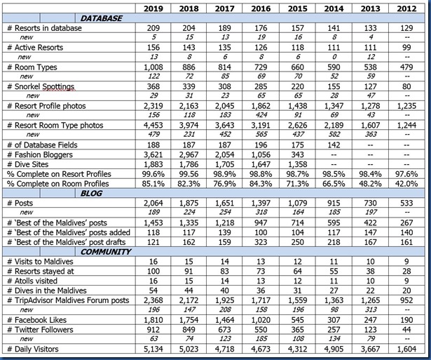
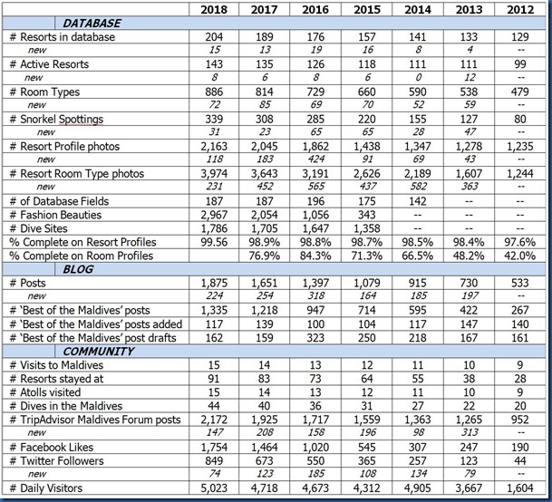
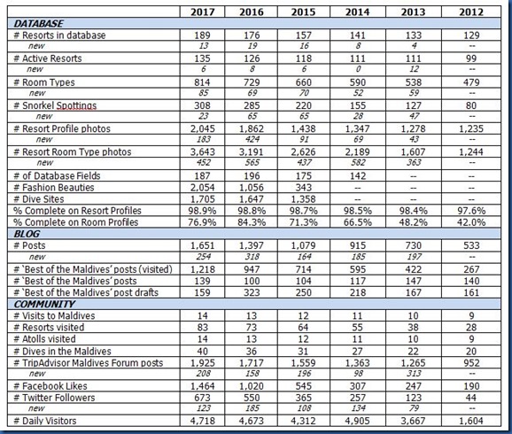
Happy 11th Anniversary to Maldives Complete. Time for another taking stock of where we have been.
The big milestone of the year was being the first people ever to stay at 100 Maldives resorts. We have also visited every atoll which has more than 2 resorts (the resort atolls that we have not yet hit are Vaavu, Shaviyani, Thaa and Laamu).
In many ways, it is the culmination of years of striving for a complete compendium of useful and accessible information about the Maldives resorts underpinned by before assiduous regular research as well as expansive first hand experience.
Another year has passed without the addition of any significant functionality. That implies to me that the site is pretty “feature complete” (as they say in the software sector). On one hand, I haven’t had to dig into major overhaul work of new capability. On the other hand, more resorts than ever (and opening faster than ever with a record 13 new openings) which means more details to keep up with. Also, having written 1,574 “Best of the Maldives” posts, it is a bit harder identifying distinctive, new features (though with 283 of my “Not Yet Seens” still not yet seen, there’s plenty of possibilities and still the innovation keeps flowing bringing more and more creative aspects to this destination of superlatives).
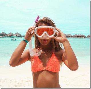
Complete paradise!
